


Epidote Tree Brand Guidelines
Fast Facts
Background
This was a design project where I created a complete brand identity package from scratch.
Project Results
At the end of this project I had a better understanding of brand creation and branding elements.
Lessons learned
-
Important elements of a brand guidelines package
-
Adapting designs to be utilized in multiple mediums (print vs. web)
-
How to refine ideas into a brand story


Software


Case Study
Overview
This project involved creating brand guidelines for a fictional brand. I called the brand Epidote Tree, a publishing house that prided itself on helping smaller authors get their work out into the world. Epidote is a gemstone with a green colour, which reflects the “hidden gems” coming from the publishing house.
These guidelines would define the brand’s identity and serve as a reference for creating various promotional/marketing materials. This brand guideline would include a logo, colour palette, type palette, and more.
As a digital art and design student, my key role was to learn about branding strategies while utilizing my creative skills to create polished work.
The Challenge
The challenge this project provided was creating a brand from the ground up, while ensuring all essential content was suitable for print production. It required creative thinking, attention to detail, and familiarity with best practices for print production.
Design Process
1. Research and Inspiration. To learn about the processes involved in creating print designs, I watched Claudia McCue’s Linkedin Learning course, Learning Print Production: Photoshop, Illustrator, and InDesign.
To gain ideas for the brand, I researched a few publishing houses to learn about their practices, and put together a moodboard capturing what I wanted Epidote Tree to look and feel like. I was aiming for peaceful, natural, down-to-earth feelings.

2. Ideation. I sketched out lots of ideas for the logo, combining any and every idea I could think of. I explored many themes of trees, gems, and sparkles.

From the first round of iterations, I picked the ideas I believed were the strongest and made another round of sketches.

3. Feedback and Refinement. I showed the sketches to my peers for feedback and went forward with the most popular version, featuring a pair of gems with a tree growing out from it.
A piece of feedback I had was to add more gems near the base of the tree, so I did a few sketches implementing that idea.

4. Asset creation. With my final logo design, I chose colours and fonts for the brand, and digitized the logo.
I also wrote out other key information for the brand, such as its values, logo usages, and other brand guideline essentials.

5. Finalization. Using Adobe InDesign, I compiled all the brand content into a cohesive brand guidelines document.


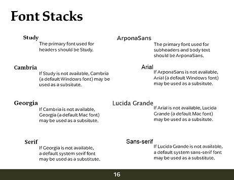


Using these brand guidelines, I created several print designs for the brand, such as business cards, brochures, and more.

Lessons Learned
-
Important elements of a brand guidelines package
-
Adapting designs to be utilized in multiple mediums (print vs. web)
-
How to refine ideas into a brand story
Conclusion
The project served as a valuable opportunity to learn about and practice many aspects of branding and print production. By developing a polished set of brand guidelines, I was able to sharpen my skills in brand development and print production with industry standard software.